

A potential client lands on your website with a knot in their stomach. They didn’t search for what you do just for fun. They have a problem that needs to be solved, a pain that must be addressed, or a desire that must be met. They’re looking not just for information, but for the right person to help them.
A great homepage meets these visitors where they’re at. It acts as a stand-in for you — the next best thing when you’re not available. It connects, resonates, and provides an empathetic, transparent, and reassuring experience. It makes sure the right people feel seen and understood by acknowledging their problem and their goals — and the gap they need bridged.
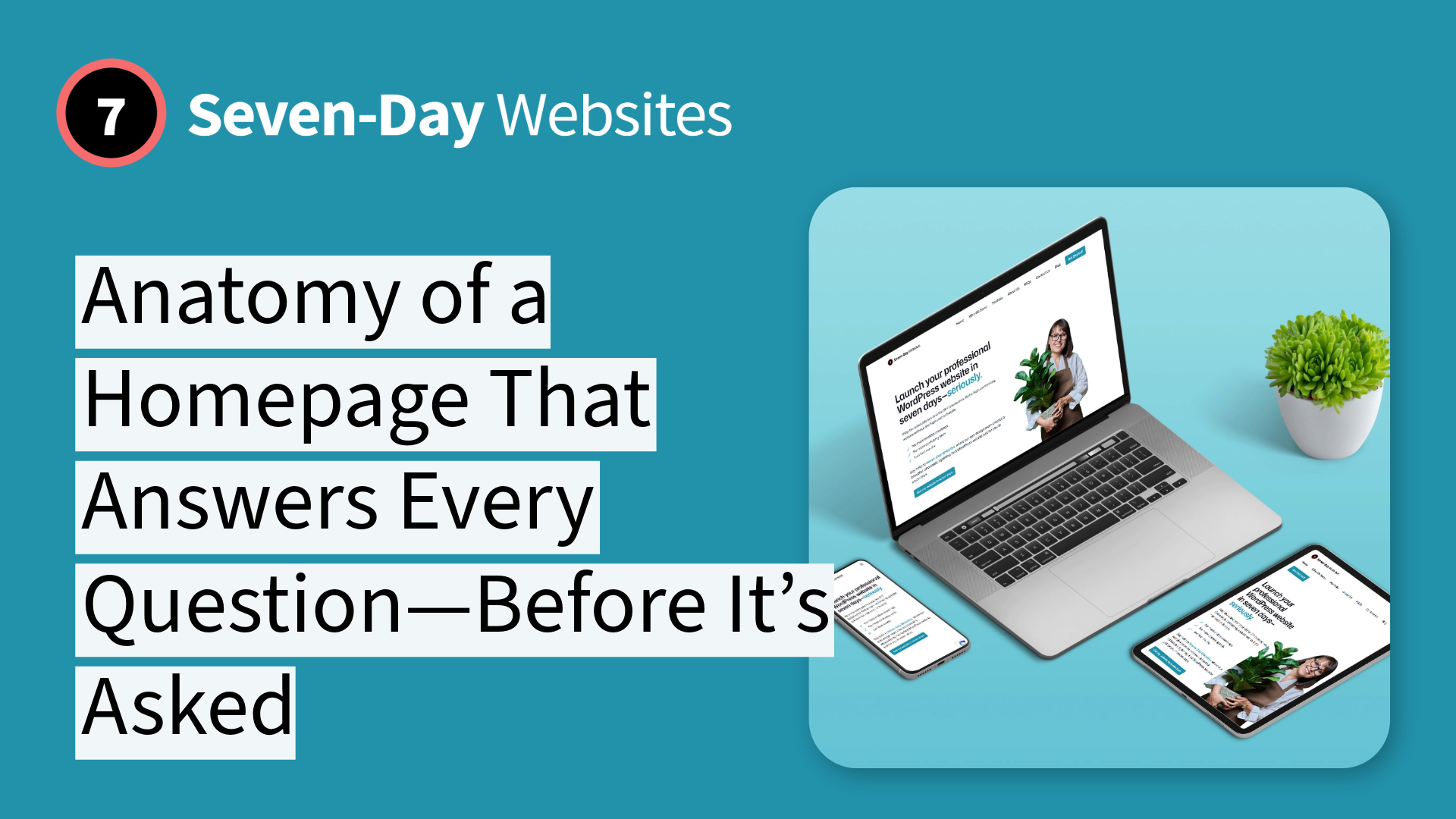
Let’s break down the anatomy of a homepage that does exactly that. And to show you we practice what we preach, we’re going to use our own.
A Bold Promise Tackles the Biggest Fears First
The first three seconds a visitor spends on your site are critical. Instead of a vague greeting like “Welcome to our website,” you need to make a powerful promise that cuts directly through their anxiety.
The Seven-Day Websites headline does this well: “Launch your professional small business website in seven days—or it’s free.”
This isn’t just a headline; it’s a powerful strategy known as risk reversal. In one sentence, it neutralizes the two biggest fears that plague every web design project:
- Unpredictable Timelines: “seven days” replaces the fear of a project that drags on for months.
- Wasted Money: “or it’s free” vaporizes the fear of investing thousands into a process that doesn’t deliver.
When your homepage opens with a headline that makes a confident promise and guarantee, it creates immediate credibility and makes visitors lean in.

Naming the Pain Shows You Understand the Struggle
Once you’ve made a promise, you have to show you understand why the visitor needs your services or product. The most powerful way to build a connection is to prove you understand their struggle on a personal level.
The “What is holding you back?” section does this by listing the exact thoughts that keep business owners stuck: “I don’t have the time,” “I don’t have the content,” “I don’t know where to start.”
This is a sincere act of empathy. By naming these specific pains, you help visitors see that you understand what they’re facing, dealing with, going through, or fighting for. The conversation immediately shifts from a sales pitch to a supportive dialogue. It’s the website’s way of saying, “You’re in the right place. I get you.”

Providing a Plan Turns Overwhelm into a Simple Roadmap
For a busy business owner, the fear of the unknown is paralyzing. The “how” of web design feels like a black box. Our homepage replaces that fear with a simple, clear plan.
The “Our Foolproof Plan” section is the antidote to overwhelm. It transforms the complex, intimidating process of creating a website into three clear, manageable steps:
1. We interview you.
2. We build your site.
3. You launch.
This simple roadmap turns a scary forest into a well-lit garden path. It makes the entire process feel achievable and puts the business owner back in control.

Replacing Price Anxiety with Price Clarity
After seeing a clear plan, the next question in a prospect’s mind is always the same: “Okay, but what is this going to cost me?” Most agencies hide this answer behind a “Request a Quote” button, creating a new wall of anxiety.
A strategic homepage demolishes that wall. By displaying a clear, all-inclusive price—“Your beautiful new website is only $1498”—you replace price anxiety with price clarity. This isn’t just about showing a number; it’s an act of transparency and respect. It tells the visitor you have nothing to hide and you value their time, which makes them trust you even more.

Don’t Take Our Word For It. Let Your Customers Tell the Story
After the plan and the price, a strategic homepage introduces the voices of others. This is the power of social proof. When a nervous prospect sees testimonials from other business owners just like them, it creates an immediate sense of safety and validation.
It’s a mental shortcut that says, “If it worked for them, it can work for me.” Letting your happy customers reassure a new prospect is far more powerful than anything you can say about yourself. It’s the moment your promise becomes a proven result.

The Final Handshake Removes the Last Bit of Risk
Even with a bold promise and a clear plan, a small flicker of doubt can remain. A truly strategic homepage anticipates this and addresses it head-on.
Seven-Day Websites’ last home page section, “Still not convinced?” offers a clear money-back guarantee. It’s the ultimate trust signal—the final, confident handshake that removes any lingering risk. It proves that you stand behind your process and your promise so completely that you are willing to shoulder all the risk yourself. It’s the easiest way to make a potential client feel safe.

From Anxious Prospect to Confident Partner
A homepage that converts is not a random collection of features. It’s a deliberate journey.
It’s a strategic conversation that expertly walks a visitor from a state of fear and skepticism to a feeling of complete confidence and clarity. By making a bold promise, showing empathy, providing a clear plan, and removing risk, you make the decision to click “Get Started” feel like the easiest, safest, and most logical choice they can make for their business.
This approach isn’t about using clever marketing gimmicks. It’s about creating a sincere conversation that makes your visitors feel understood and safe. We don’t see these as tactics; we see them as principles, and we stand by every one of them.
If you want your website to treat your customers with this same level of thoughtful strategy, then you’re in the right place. Get in touch, and let’s build yours.